Setting the table: 3 creative ideas worth copying
Guide

Setting the table: 3 creative ideas worth copying

Pia Seidel
21-5-2024
Translation: Patrik Stainbrook

During Milan Design Week, a veritable feast of culinary experiences was served up for our viewing pleasure. We can learn plenty from it.

Setting a table can become routine, but it doesn’t have to. Three multi-sensory tablescapes I saw at Fuorisalone proved this to me. With their unique designs, they turned food into a talking point. From a change of perspective through explosions of colour to orderly chaos, here are three creative ideas you can keep in mind when you next set your table.

1. Repeat elements

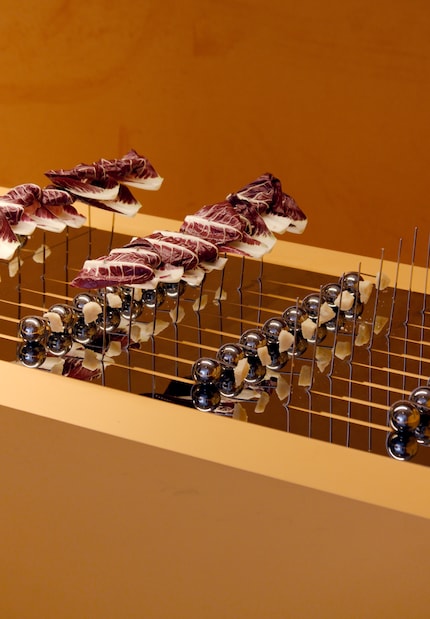
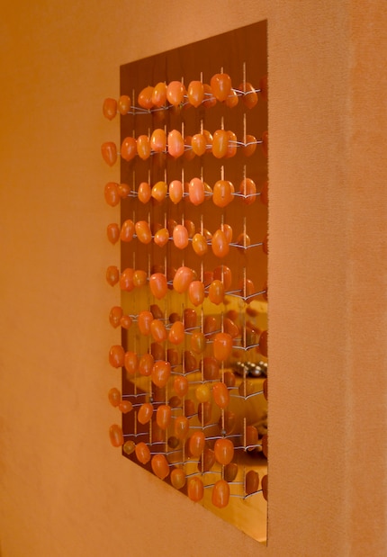
Ananas Ananas turns food into design. The food art studio from Mexico, founded by Verónica González and Elena Petrossian, specialises in the design of culinary events. At Milan Design Week, they staged a pop-up bar in the Caffè Populaire. On display – customised table decoration made of mirrored stainless steel, surrounded by a backdrop glowing in orange. «These installations are meant to be temporary,» says Petrossian about the studio’s work in an interview with WWD. «They should be enjoyed in the present – and that’s it.»
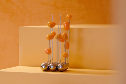
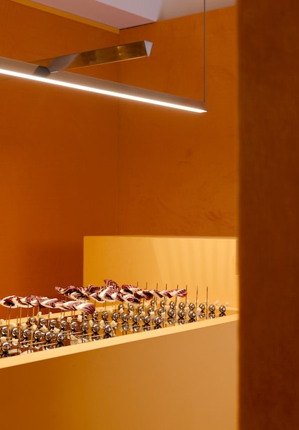
The tablescape from food art studio Ananas Ananas focused on repetition.
Source: Pia Seidel
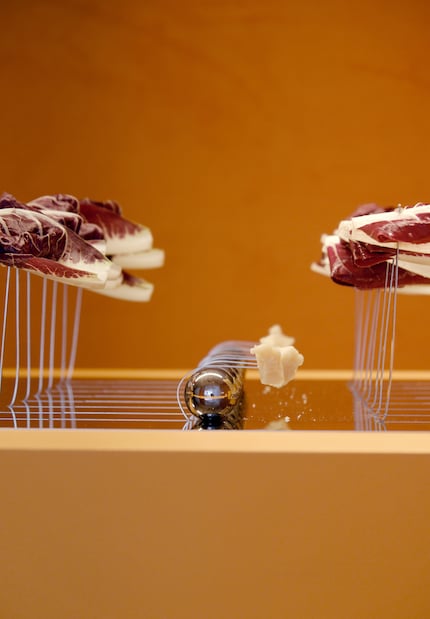
Aperitivo tableware from Ananas Ananas was designed to match the food.
Source: Pia Seidel
It’s made entirely of stainless steel.
Source: Pia Seidel
Prettier than your average toothpick: each skewer sprouts individually from a single large plate.
Source: Pia Seidel

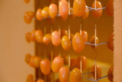
The food art studio designed extra tableware for each selected item to offer guests an immersive experience. Some tomatoes were attached to a metal object on the wall, like an abstract painting. Other vegetable canapés were draped on a horizontal metal plate with filigree skewers.
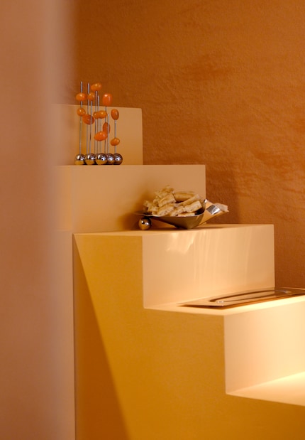
Even small bowls look better on a pedestal.
Source: Pia Seidel
The fact that the tomatoes are hanging provides a change of perspective.
Source: Pia Seidel
The repetition creates an impressive interplay of shapes and colours.
Source: Pia Seidel

How do I copy the look? By changing perspective and planning repetitions. For example, you could look for ways to hang up some of the food. And think about how you can arrange the same fruit in different ways on the table. If possible, limit yourself to a single material. Ananas Ananas only featured stainless steel accessories. Same goes for the colour palette: when choosing flowers, decorations and textiles, make sure you stick to one colour scheme. This makes tomatoes and the like stand out more.

2. Decorate tone on tone

The duo consisting of Eleni Petaloti and Leonidas Trampoukis specialise in impressively staging still lifes and walk-in installations. Their studio Objects of Common Interest presented Purple Nebula at the Nilufar Gallery. The collection consists of vases, plates and furniture inspired by a wonder of space – planetary nebulae. «Purple, a colour rarely found in natural formations on our planet, is abundant in the ethereal nebulas of outer space,» the press release reads. The design duo wanted to create a monochromatic dining area in purple for their presentation.
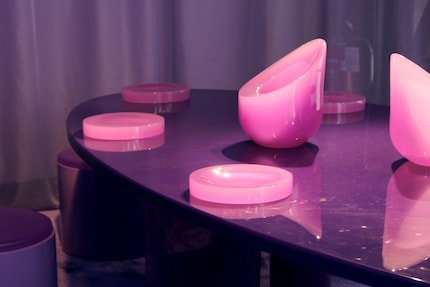
The arrangement of Objects of Common Interest wowed with one and the same colour family.
Source: Pia Seidel

Semi-transparent curtains and a circular carpet create a secluded area reminiscent of diffuse fog. «In this space of community and togetherness, subtle shades of purple draw the eye inwards and encourage a heightened sense of concentration.»
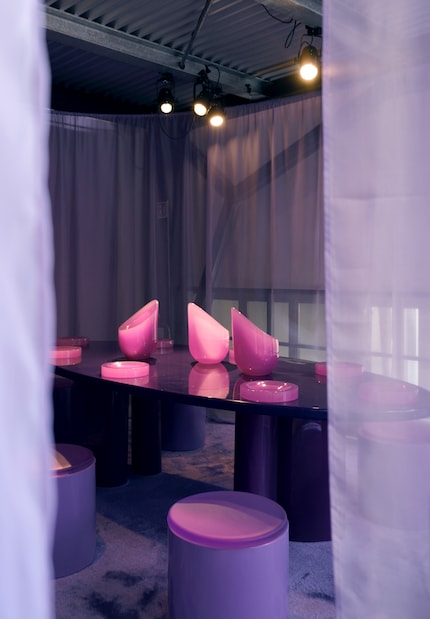
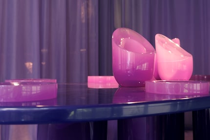
The vases and plates are made of cast acrylic paint. They share the same colour and design language as the dining table, stool and carpet.
Source: Pia Seidel
As everything has the same colour, the focus is drawn to tactile textures and materiality.
Source: Pia Seidel

What this arrangement teaches us? Less is more. Stick to one colour for table decorations and tableware. This creates a harmonious overall look and magically attracts attention. If you want to go the extra mile, add textiles of the same colour to the room to complete your look. You can easily find tips on how to temporarily hang curtains from the ceiling online. For example, using discreet nails on the wall, washing lines and telescopic rods to help with fastening.

3. Finding calm in the chaos

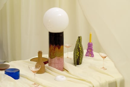
Spanish design studio Mas Creations presented an installation called Around the Table at Milan Design Week, curated by Studio by Isola Design. It consisted of a lavishly laid dining table, inviting participants to take a seat and immerse themselves in controlled chaos. «This table becomes a stage for interaction where emotions and experiences intertwine, creating a microcosm of diversity and convergence,» writes Mas Creations in an Insta post. The set-up is a reminder that «chaos is not the enemy of order, but an integral part of it».

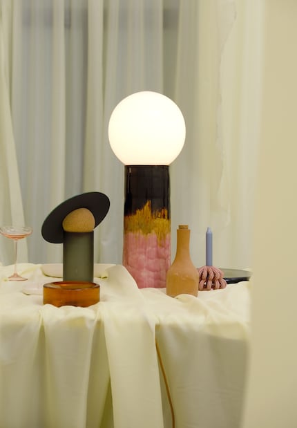
The installation by Mas Creations scored points with diversity.
Source: Pia Seidel
Lamps, oil and decorations – many shapes, materials and colours came together here.
Source: Pia Seidel
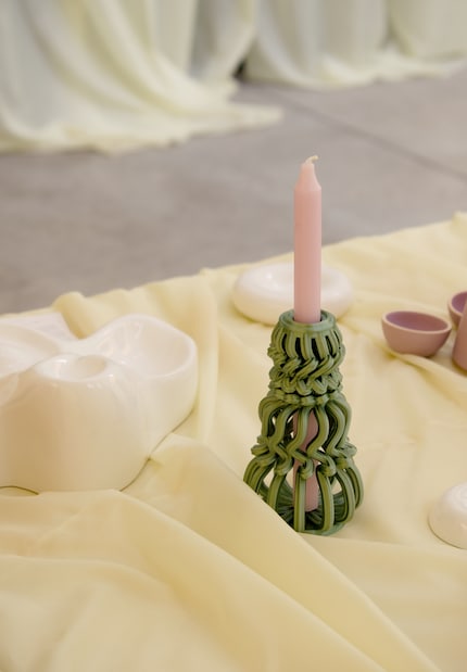
Handmade objects stood calmly next to 3D-printed pieces.
Source: Pia Seidel

In the eyes of Mas Creations, the table symbolises unity. Different guests and all kinds of emotions take their place here. The style of place setting can be just as diverse. In addition to lamps by Mas Creations, pieces by many designers were on display for this reason: Agne Kucerenkaite, Clemence Birot, Daniel Van Dijck, Formandseek, Frantisekjungvirt, Kerafak, La Muerte Tiene Permiso, Pilgrimsurfsupply and Studio Jonathanra Detz.

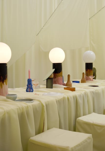
Instead of ceiling lamps, many table lamps were used.
Source: Pia Seidel
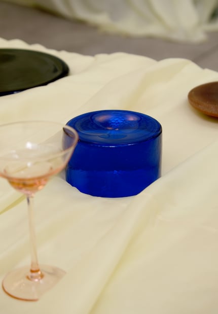
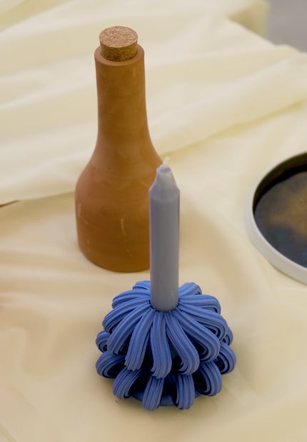
The rich blue of some objects formed a contrast to the rest.
Source: Pia Seidel
The repetition of colours and shapes creates a balanced scene.
Source: Pia Seidel

To create a similar table setting, it’s worth opting for cordless lamps. Together with candlelight, they create a cosy atmosphere. As with the monochrome look showcased by Objects of Common Interest, textiles of the same colour also contribute to a harmonious overall look. But they aren’t a must. What’s more important is that you celebrate different design styles and repeatedly incorporate a colour-blocking effect. Similar to the Ananas Ananas arrangement, repetition ultimately leads to a uniform image. Another detail that ensures visual calm despite the mix of colours: oil that’s been decanted into bottles in matching colours so no packaging disturbs the pretty picture.

Header image: Pia Seidel

12 people like this article


User Avatar
User Avatar

Like a cheerleader, I love celebrating good design and bringing you closer to everything furniture- and interior design- related. I regularly curate simple yet sophisticated interior ideas, report on trends and interview creative minds about their work.


These articles might also interest you

Comments

Avatar