Background information
Fine Art Printing, Part 1 – basics and printers
by Samuel Buchmann

Wrong colours are annoying, whether on a monitor or on paper. In this colour management deep dive, you’ll learn what you can do about it.
First off, congratulations. You actually clicked on an article with «colour management» in the title. A topic that most people avoid like the plague. But it’s important. Especially if you take photographs – and even more so if you print images.
The second part of my series on fine art printing isn’t just about printing, but the entire colour management chain. It has to be perfect, flawless. If you missed part one of the series, you can find it here:
I want this article to be as comprehensible as possible, as in-depth as necessary. As a result, it’s pretty long. If you already have prior knowledge, use the sections to navigate to the topics that are particularly interesting to you. At the end, you’ll also find a summary of the most important points.
Colours and contrasts should look the way you intend them to. Maybe like reality, but maybe different. It’s important that you make this decision consciously. Only problem is, there are so many steps that happen automatically between taking the photo to viewing the final print – and if you’re not careful, they’ll happen in a way you don’t want.
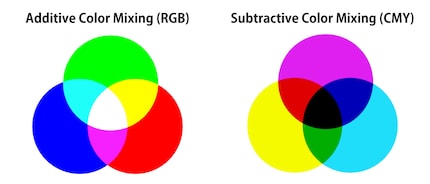
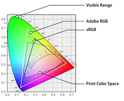
Cameras, monitors and printers can display different colour spaces, and they sometimes require signals in different formats. Simply put, they speak different languages and have different vocabularies.
The information has to be translated, then. From reality to camera sensor, from sensor to computer, from computer to screen and from computer to a printer. That takes a dictionary’s worth to translate.
These dictionaries are called ICC profiles in colour management. They’re files that contain numbers and mathematical formulas, as colours are stored in number form. For monitors, for example, there’s the «red, green, blue» format. An ICC profile can translate these values into another language. For example, in those of a printer, i.e. «cyan, magenta, yellow, black». And it can convert values from one colour space to another.
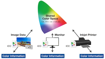
If there were only one type of sensor, monitor, printer and paper in the world, it’d be a simple matter. Someone would calculate these tables correctly once and everything would be fine. But with countless variants, things get complicated. Not only do you need colour profiles that translate between different languages, you also need devices that correct deviations from the standard.
Welcome to hell colour management.
There are three types of errors that can occur from recording to printing:
Some problems can’t be completely avoided, others can. Below you’ll learn how to calibrate the three phases of an image – capture, display, print.
No image sensor can cover the colour space of our retina. It’s impossible to achieve a one hundred per cent colour-accurate image. The standard profiles of cameras and RAW converters don’t claim to reflect reality. They should look good – and «good» is a matter of taste. There are profiles that approximate natural colours. One of the most successful examples is Hasselblad’s Natural Color Solution. However, even such profiles are adapted to average lighting situations and don’t apply universally as a result.
Instead, you can create your own colour profiles – for your specific camera in a specific situation. For this, you need a physical colour chart such as the Xrite ColorChecker. Take a reference image using this chart and feed it to the associated software. This will compare the actual values of the photo with the target values of standardised colour fields. The result is an ICC profile that compensates for deviations, which you can then import into your RAW converter.
Colour charts such as ColorChecker are available in different sizes. They’re expensive because they have to be extremely accurate. The more colour patches it has, the more accurate the profile will be in the end. In my experience, however, there will still be deviations from reality even then. Because of the effort involved, this method is only useful for static setups such as a product photography station, in my opinion.
Screens are a completely different story. Calibrating them is simple and always a good idea. This also goes if you aren’t editing photos for printing, an image will look different on another monitor anyway. However, a calibrated device offers the best possible average.
Any screen can be calibrated with a colorimeter such as the Spyder X. Here, software displays various colour fields and the sensor measures what your monitor is actually showing. The software corrects differences between actual and target values with an ICC profile, which it saves in your computer’s system settings. Expensive graphics monitors have built-in calibration sensors and store the profile in the monitor’s hardware, meaning colours will also be correct when you switch computers. Screens wear out over time and become inaccurate, so you should recalibrate them every few months.
Calibration can correct colour shifts, but can’t improve the colour space of your monitor. An old gaming monitor still won’t be suitable for image processing in AdobeRGB, you simply won’t see some colours. Buying a monitor with good colour space coverage is worth it. If you’re editing images for digital purposes, sRGB is mainly important. AdobeRGB has established itself as the colour space of choice for printing. It’s the better common denominator, even if a print is only ever an approximation of what you see on a monitor.
You’ve edited your image on a calibrated monitor and are happy with it. Now you have to make sure that it translates correctly into the language of your printer. This also requires an ICC profile. Every printer is different, and inks themselves look different on every type of paper. You’ll need a separate profile for each printer/paper combination.
There are two levels of printer calibration:
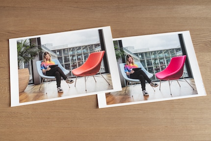
Colour management has to be seamless. A single incorrect setting is enough to distort the result. Luckily, many options will be automatically correct. However, there are stumbling blocks in some places.
If you shoot in RAW format, you can basically do nothing wrong on the camera. For example, it doesn’t matter which colour space you’ve set. Picture style and white balance also only make a difference on the camera display. You can change both later on the computer without loss. Depending on the camera, smaller resolutions or different bit depths can be selected for RAWs. For fine art prints in particular, I’d recommend using the highest settings despite large file sizes.
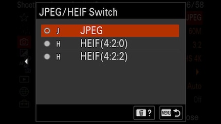
In addition to RAW, there are compressed formats. JPG, and in new cameras HEIF. You have to choose your settings carefully here. White balance and image style are burned into the file during recording. If you want to change them on the computer, this will reduce image quality. You can also only reduce the colour space. Say you photograph JPGs in sRGB, the camera will discard all information outside of this colour space. There’s no point in converting the file to the larger AdobeRGB later, any additional colours the sensor captured will have disappeared.
You can make two mistakes when editing images:
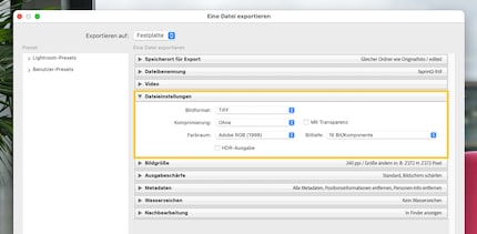
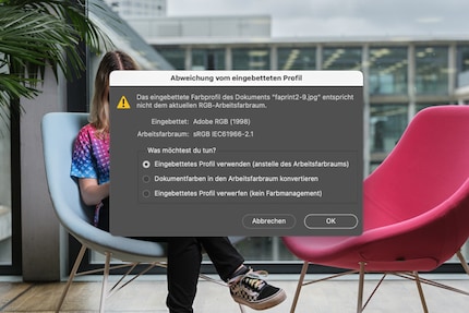
If you don’t want to calibrate your monitor, look for a setting that’s as neutral as possible. For example, many screens have an sRGB mode. Although this usually won’t be particularly accurate, it’s better than the oversaturated standard settings with too much contrast. Some monitors also come with AdobeRGB mode out the box.
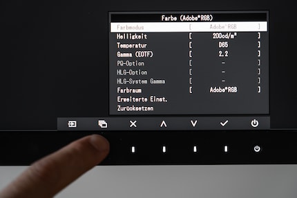
For fine art printing, however, it’s better to calibrate your monitor yourself. You can determine various parameters: colour space, brightness, gamma curve and white point. These settings are adjusted to the average end device or product. The rules of thumb:
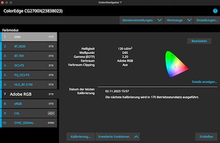
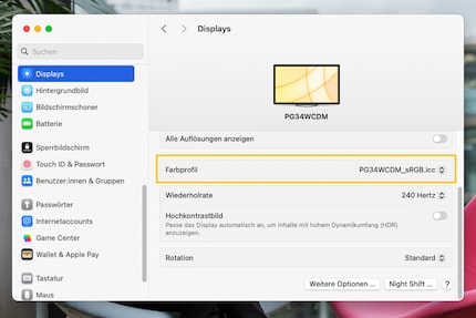
After calibration, the software automatically saves the resulting ICC profile in the right location and activates it in the system settings. If this doesn’t work for any particular reason, you can choose it yourself. In macOS, it’s under System Preferences > Displays > Color profile. On Windows, the setting is hidden deep in the menus. The easiest way is to enter Colour Management in the search field.
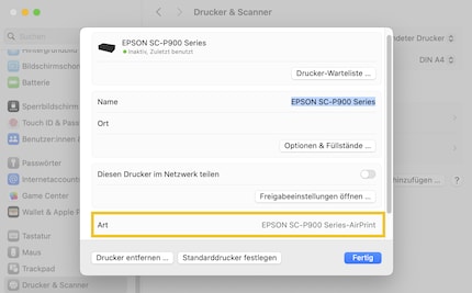
First, you need to install the correct printer driver from the manufacturer. Only then do you add the printer in your system settings. If you use Mac, be careful. When adding the printer via the Bonjour protocol, only the AirPrint driver will be installed, which doesn’t include all necessary options. You can see this when you click on the printer in the system settings after adding it. Instead, select the TCP/IP protocol when adding.
Fine art printers are quite backward devices. Almost nothing works automatically or intuitively here, especially if you work with paper from third-party manufacturers such as Hahnemühle. I think you should, by the way (more on this in the next part of this series).
You need to tell the software and the printer four things:
Annoyingly, these settings are in different places depending on your system and program. The screenshots in this article are from Lightroom in macOS Sonoma.
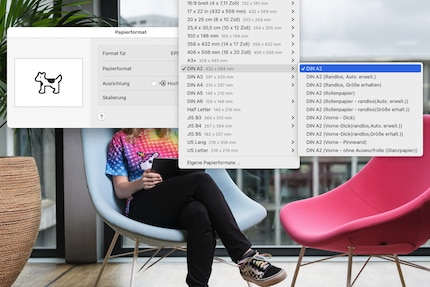
The paper format in Lightroom is at the bottom left under Page Setup. In Photoshop, however, it’s located in the Print Settings dialogue box. The choice of formats is huge. You could also activate borderless printing here. However, experts advise against this as the print head has to print a little beyond the paper, which can damage it.
You have to set the ICC profile manually if you’re printing with third-party paper manufacturers. To do this, download the appropriate profile from the manufacturer’s website. Here are the links for Hahnemühle and Ilford, just to name two. You’ll receive an ICC file and a PDF doc, usually. Save the ICC file in your system:
The profile will then appear in your printing program. In Lightroom, it’s in the right-hand column under Color Management. In Photoshop, it’s again Color Management in the print window. If you’re printing on a Canon printer with Canon paper or on an Epson printer with Epson paper, the necessary ICC profiles will be integrated in the printer driver. In this case, you can set the colour management to the printer default.
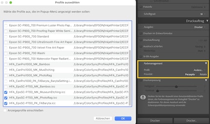
You set the rendering intent directly below the ICC profile. It determines what happens to colours outside the printer’s colour space:
For many photos, it doesn’t matter which of the two intents you choose, the colour space of the image will fit completely with the target colour space. If this isn’t the case, you’ll achieve a better result with Perceptual or Relative Colorimetric, depending on the image. For the latter, you should check the Black Point Compensation box in Photoshop. Lightroom does this automatically.
Print settings can be found at the bottom left in Lightroom and at the top of the print dialogue box in Photoshop. Paper settings are particularly important here. For Epson they’re under Options > Printer Preferences, for Canon under Options > Quality and Media.
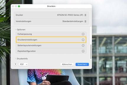
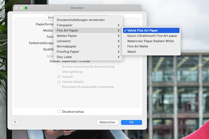
With native paper, the settings are self-explanatory. For example, if you’re printing on a Canon printer with Canon Professional Platinum paper, select that medium in the settings. For third-party paper, you’ll receive a PDF telling you which setting you should select for the specific paper as an attachment with the ICC profile (for Ilford, the instructions are here). For a Hahnemühle Photo Rag on the Epson SC-P900, for example, it’s Velvet Fine Art Paper.
If your colour management chain is completely correct, the finished print should look the same as on the monitor – but only under normal light, with a brightness of 2,000 lux and a colour temperature of 6,500 Kelvin. Normal interiors are darker. If you want to generate standard light artificially and accurately, you’ll have to pay. Using a lamp like this one, the colours will at least be reasonably correct, even if the brightness isn’t. The simplest solution for neutrally viewing a print is a window without direct sunlight.
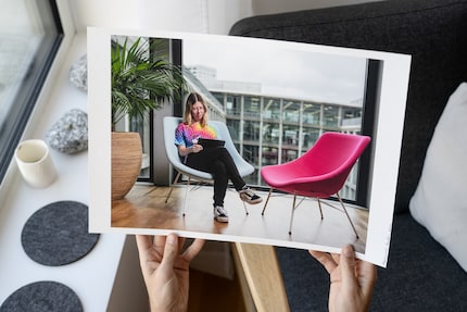
However, think about what will happen to your print. Where will you hang it or look at it? If the picture is intended for a dark hallway, you can brighten it up and add contrast. Under artificial light, colours appear yellower than in daylight. You can also compensate for this if you want.
Colour management is a huge topic. This article alone is pretty lengthy, and you’ll find huge treatises on each individual topic on specialist websites. Here are the most important points in brief:
If you feel overwhelmed by colour management, don’t worry. Most of it is repetitive and you’ll only have to set things up correctly once. It’s worth the effort. Once everything is set up, you save time, nerves and printing material – and can devote yourself to the creative decisions.
The third and final part of this series also deals with a creative decision – your choice of paper.
My fingerprint often changes so drastically that my MacBook doesn't recognise it anymore. The reason? If I'm not clinging to a monitor or camera, I'm probably clinging to a rockface by the tips of my fingers.
Interesting facts about products, behind-the-scenes looks at manufacturers and deep-dives on interesting people.
Show all